Overview
Ventus is a smartphone app for water sport enthusiasts, like surfers, kiters or sailors or fishermen. It displays complex weather phenomenons in an accessible, easy-to-comprehend way. The app allows user to catch the perfect wind with a detailed report, notifications, information about clouds, rain or air quality. Ventus can also visualize currents, waves, tides, water temperature or users can discover new hot spots for their favorite water sport activity.

Purpose, Context and Objective
Ventus was created as part of my UX design programm at CareerFoundry. The goal of the project was to illustrate the UX design process from start to finish. The objective was to provide beautifully displayed and easy to understand wind, wave and weather reports, forecasts and statistics for sailors, surfers, divers and any other water sport aficionado.
The overall problem I wanted to solve with Ventus was, how to display complex, real-time and also predicted data in a visually appealing and easy-to-digest way. Many apps with similar features are visual but don’t display data in a way that makes it easy for everyone to understand. My goal was to enable everyone who is interested in weather phenomenons to easily grasp the relevant information.
Approach and Process
While approaching the tasks I relied on the iterative Design Thinking process. Below I listed all the steps that I’ve taken while creating the prototype for Ventus.

Step 1: Understand
To understand the market and to see what other apps are capable of, I started my project by conducted an extensive competitive analysis, in which I evaluated two other apps. Analyzing the strenghs, weaknesses, opportunities, threats, usability and the general appearance already helped me to brainstorm some features and user flows that I could improve on.

Step 2: Observe
Getting to know the potential user and his/her goals, needs and pain points is crucial while designing a user-centric software. I conducted three interviews to find out more about my users, their habits and past experience with similar apps and to understand, in which context they would use a wind & weather application.

Step 3: POV
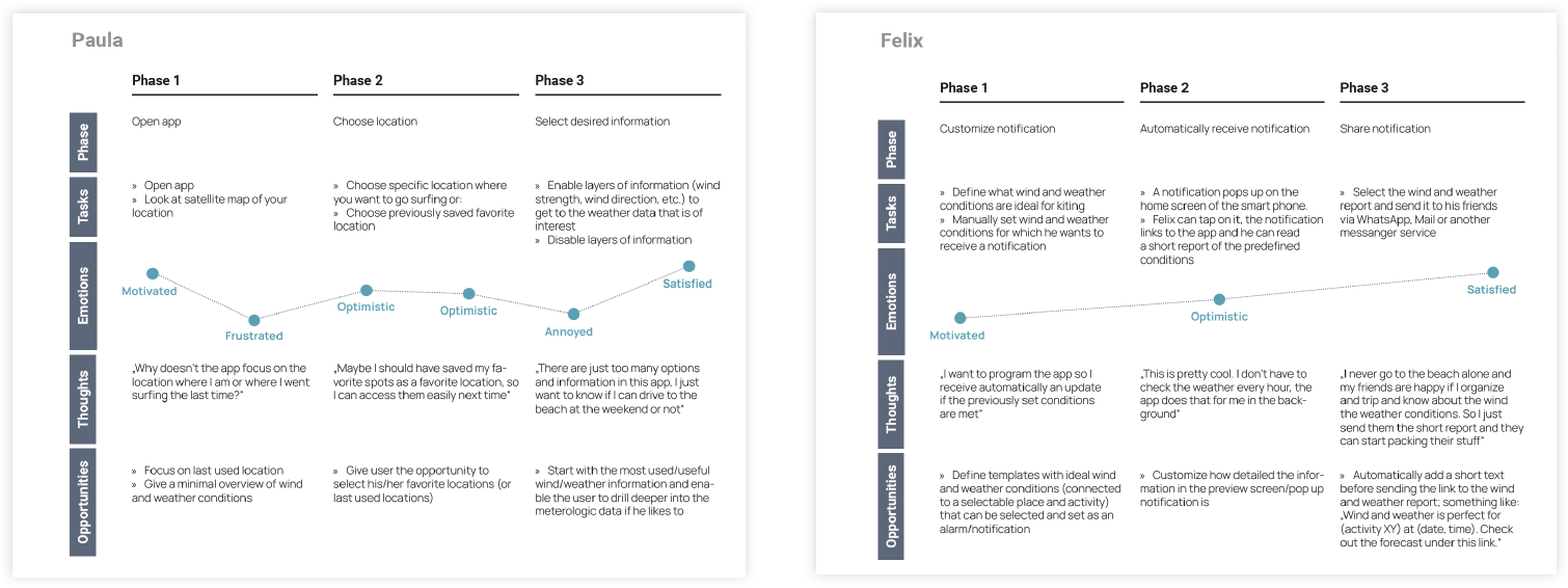
I‘ve organized the findings from the interviews and documented them as sticky notes and arranged them into clusters. In the end I‘ve used these valuable data to create the two distinct User Personas Paula and Felix, that represent hypothetical groups of users.

Step 4: Ideate
Now that I‘d created the personas it was time to see how they would interact with the features that were planned for the wind and weather app. I‘ve created two user scenarios, one for each persona and wrote down the different phases as well as the emotions, thoughts and opportunities that have occured during the process. This helped me to see hurdles within the phases, where the user needs more guidance, comfort or advice within the particular action or flow.
After that I created a first iteration of a sitemap that included all pages and features of the app. The verify my ideas with real users I conducted an online card sorting with a small group of participants and used the results to revise the initial sitemap. For this I used the online tool Optimal Workshop. I created 30 cards and nine categories. Looking at the results of the card sorting reveals both a varied placements of the participants but also a clear pattern for almost every of the 30 cards.

The new sitemap is a lot more complex and covers more functions than the first iteration. It‘s also more detailed and fleshed out. While the first version included only categories and some function overview, this sitemap gives a overview over the use cases and what data and information the user can expect when using the app. It is a great and helpful tool to build up a use case backlog and to have a structured overview over all necessary functions.
Step 5: Prototype
Taking everything that I’ve learned during the research phase I started working on the first low-fidelity wireframes. I sketched basic features based on the previously defined features and user flows. I started sketching all wireframes with an ink pen on paper. After that I took pictures of the screens. loaded them into the Adobe Photoshop and polished the screens to give them a cleaner look. Then I placed them in the frames of a Mobile phone and a Desktop browser.

After creating the initial sketches on paper, I developed the ideas further and recreated them digitally as mid-fidelity wireframes. For this task I‘ve used the browser-based tool Balsamiq, which led me easily sketch mid-fidelity wireframes with premade assets. It is a great way to add more details to the existing wireframes and to revisit and to question some design decisions.

For the high-fidelity wireframes I decided to work with Adobe XD. I created
several screens to showcase the basic functions of the app like focusing on your current location, switching on and off wind and weather layers or selecting a favorite location. Creating the prototype took a lot more time than the
mid-fidelity wireframes because the amount of details is a lot higher and the overall design is more complex. I even created the map and the weather animation from scratch. I took all the screens and created a clickable prototype in Adobe XD.


One of my tasks in the course was also to create desktop version of my app. Even though I mainly focused on the mobile app, working on a browser version was a great experience.

Step 6: Test
Conducting usability tests gave me a lot of insights and led to various changes on the prototype. I prepared the sessions with the help of a test plan and a script that guided me and the participants through the sessions. The test plan outlined the basic parameters of what, where, how and who. The script itself includes closed and open questions. It wants the participant to try out different functions and give his/her impression of the app.

After conducting six test sessions it was time to evaluate the results and to make changes to the prototype. Analyzing the interviews and clustering the
results first in an affinity map and then in an Excel list was really informative and helped a lot to see hurdles, mistakes or even logical errors. After that I starting improving on the prototype and created better solutions to the reported issues.

Challenges
The initial challenge was to understand how wind and weather apps work, what their main features are and users expect of such an app. The competitive analysis and the user interviews really helped me to get into this area of expertise.
The next challenge was how to display the huge amount of information and graphical elements on a small screen – and how to do it in a visually appealing and easy-to-understand kind of way. Iterating on low- and mid-fidelity wireframes was a great way to sort, cluster and align all the necessary elements.
As this was my first UX design project, learning all the necessary tools, steps and design principles was also a challenge. The provided documents by CareerFoundry, online documentations and showcased projects on Dribbble, Behance and Awwwards helped me to shape an app that I’m really satisfied with.
Duration and Credits
I started the project at the beginning of June 2020 and finished it by the end of September 2020. I was responsible for all the previously mentioned steps.
Tools